Doom's first level, E1M1: Hangar is an iconic and memorable level, but in the context of being the first level of the game, has a surprisingly clever and interesting design. In January 2012 I wrote a bit about the design of this level, originally posted to the Doomworld forums and reproduced below.
I've been thinking a bit about the design of Doom's first level. We've all played through it a thousand times and probably don't give it much thought. The way it's designed actually strikes me as quite clever, and while I expect I'm almost certainly reading too much into it, I thought these ideas might be interesting to others.
If you were given the task of designing the first level of Doom, what would be your goals? Two main goals come to mind: firstly, the level is the first level that will be seen by most players, so it should act as a showcase for (what was then) the impressive technology of the engine. Secondly, FPS games were not as popular then as they are now, so it needs to (gently) introduce the player to basic concepts of the gameplay.
This is the first thing a new player sees. For someone who has played earlier games like Wolfenstein 3D the first view immediately showcases some of the features of the new game engine. It's worth checking out the Doom FAQ's section on "What makes DOOM different from Wolfenstein 3-D?" to understand what I'm getting at. To summarize:
CHAPTER [3]: What makes DOOM different from Wolfenstein 3-D?
[3-1]: Texture-Mapped Environment
[3-2]: Non-Orthogonal Walls
[3-3]: Light Diminishing/Light Sourcing
[3-4]: Variable Height Floors and Ceilings
[3-5]: Environment Animation and Morphing
[3-6]: Palette Translation
[3-7]: Multiple Players
[3-8]: Smooth, Seamless Gameplay
*3-9*: New Monsters and Artificial Intelligence
The first four of these points are immediately visible as soon as the game starts (non-orthogonal walls are only subtly visible, but can be seen in the initial view). You've got different floor and ceiling heights, contrasting textures that demonstrate the texture mapping effects, and some subtle lighting to show the lighting features. Moving a few steps forward and looking out the window allows the player to see the parallax skies/outdoor area.
From a functional perspective, what purpose does this area serve? My hypothesis is that this initial starting area serves as a safe “sandpit” for new players. Notice how, unless you're playing on one of the higher difficulty settings, there are no monsters until you go through the first door. Remember that many people playing Doom for the first time in 1993 would never have seen or played an FPS before. It's therefore useful that they have a safe area in which to get used to the controls and how to move around. There are even a few barrels to take pot shots at in case they want to try out the pistol.
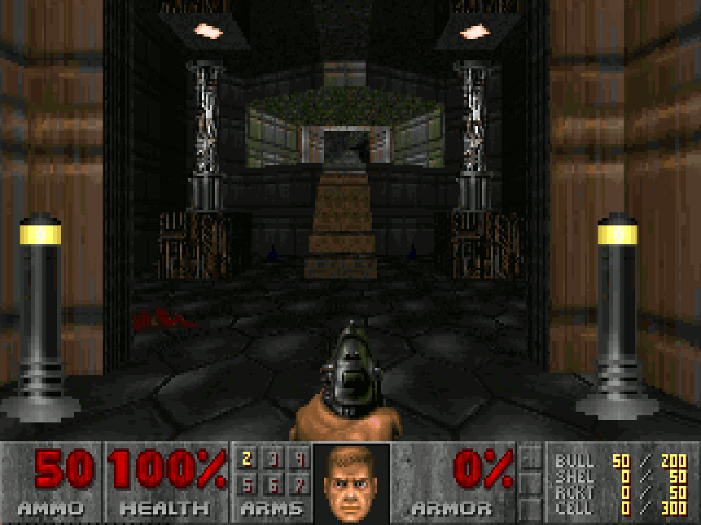
This is also in the initial area. If you want to demonstrate “Variable Height Floors and Ceilings”, what better option than a flight of stairs to do that? The tech columns on the sides of the stairs have a pulsing light effect which also provides a good demo of the lighting. Navigating up a flight of stairs provides a minor challenge for a new player getting used to the controls for the first time.
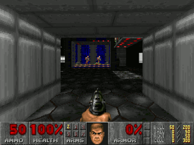
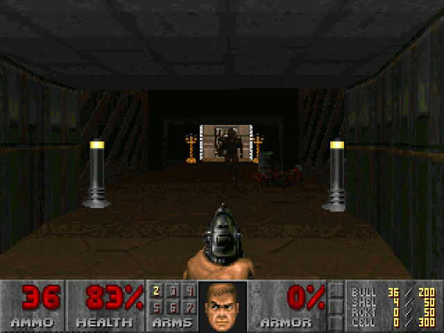
Moving through the level, this is the next area encountered. You have to open a door to proceed, so you're taught how to use the “use” key before you leave the sandpit. The first zombie troopers are immediately visible as soon as you open the door, but they're a long way away and slow moving, so they don't pose much of a threat to you. Any beginner / novice will be able to take them out before they get very close, so the player learns to use the pistol if they haven't already.
The area also serves as a further nice demo of the features of the engine — lighting from the overhead lights, different floor and ceiling heights, contrasting texturing with the computer consoles etc.
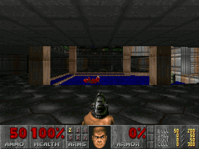
Now the slime pit room. As I see it, this room teaches the new player two things. Firstly, damaging floors exist, and if it isn't immediately obvious that the green slime is to be avoided, the player will quickly find out. There's a minor challenge of navigating the zig-zag floor to get to the other side.
Secondly, this is the first encounter with imps, so the player learns imps throw fireballs, and gets an opportunity to practise avoiding projectiles. A full-on face-to-face encounter with an imp is probably a bit too much for a beginner player at this stage, so the imp is up on the ledge where it's a sitting duck for the player to take out (or simply avoid).
In graphical terms the biggest thing in this room is the animated floor (“Environment Animation and Morphing” above). There's also a nice subtle shadow effect with the sun shining through the window.
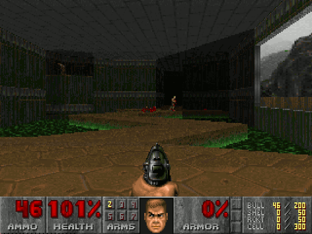
After dealing with the imp on the ledge, the player now has the challenge of going face to face against an imp, which of course can now melee attack the player in addition to launching fireballs. As an amusing aside, when I first played Doom, I thought this imp was the “boss” of the first level. It seems reasonable that if a player can defeat this imp they've probably learned enough to progress to the second level, so while it may not really be a “boss” as such it provides a good challenge.
The two candelabras next to the exit door serve perhaps as useful signposts to attract the attention of the player if they're unsure where to go next. There's also a barrel next to the imp, which an enterprising player can use to take out the imp, learning how to use barrels strategically.
Graphically this room also serves as a great demonstration of the capabilities of the engine. The “showdown” against the imp takes place in a dark, moodily lit room with an occasionally blinking light, so you can see it coming towards you but not very well. It's actually pretty spooky. If you want a scary environment, what better than a monster walking towards you through a dark room?
From then on you've basically just got the exit room. There are a few other things to note, like the secret corridor just before the imp room, where perceptive players will perhaps spot the discrepancy in the wall texture and find their way outside.
As I commented before, I'm probably reading too much — maybe Romero didn't put anything like this much thought into the level when he was designing it. But it does seem like a clever design. I'm reminded of how, for example, Half Life 1 has its “hazard course” stage that you can play through to learn the controls, or how the Portal games teach the player each of the controls and concepts gradually. Doom instead teaches the player invisibly, so you're learning how to do things without even realising.
ADDENDUM: a couple of people have pointed out I forgot to mention John Romero's design rules that he applied when making Doom's levels. They are relevant to note here because they explain a couple of features of E1M1's design, such as the 'U' shape of the level:
When designing levels for Doom, Romero came up with several rules, among them:
- always changing floor height when I wanted to change floor textures
- using special border textures between different wall segments and doorways
- being strict about texture alignment
- conscious use of contrast everywhere in a level between light and dark areas, cramped and open areas
- making sure that if a player could see outside that they should be able to somehow get there
- being strict about designing several secret areas on every level
- making my levels flow so the player will revisit areas several times so they will better understand the 3D space of the level
- creating easily recognizable landmarks in several places for easier navigation